Working with US Census Data
Geospatial Analytics with Vector Data
Problem
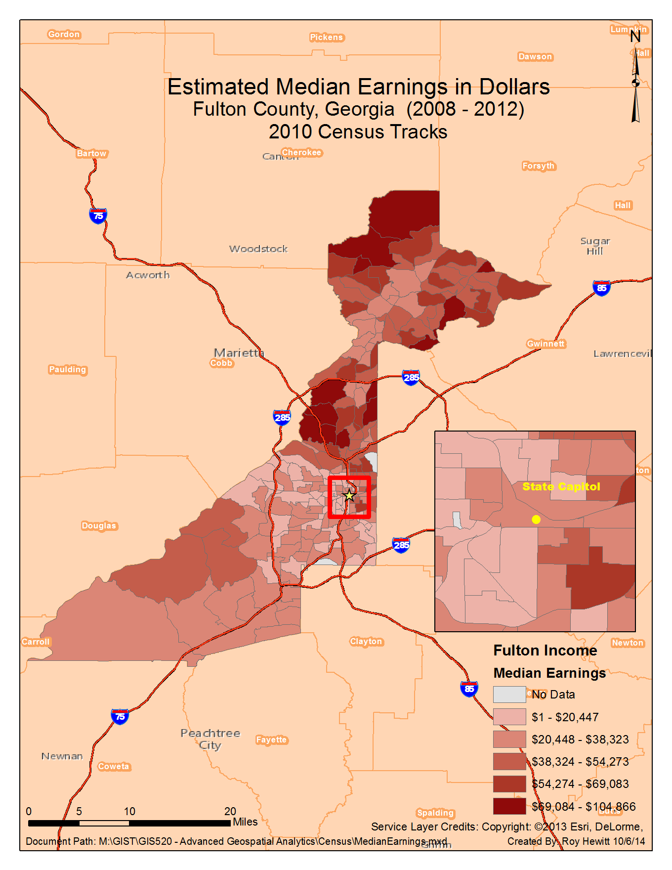
For this assignment I mapped the estimated median earnings for residents of Fulton County, Georgia from the last twelve months with data from the US Census American FactFinder. The table I used was ACS_12_5YR_S2001_with_ann.csv, which contained lots of additional information related to earnings including earnings by demographics, gender, and education. The field I used from this table was HC01_EST_VC02, which represents Total Estimate Median earnings (dollars) for a given census tract.
Analysis Procedures
Strategies
The goal of this exercise is less about spatial analysis than understanding how to consume data from the U.S. Census Bureau. I decided to investigate earnings data for the county in which I live: Fulton County, Georgia. I used the FactFinder website to first narrow my search by geography by selecting my county. I then chose the income tab, and finally the results for “Earnings in the Past 12 Months” from the 2012 American Community Survey. Downloading Census tract data is very easy. I visited the TIGER/Line website, selected Fulton County and downloaded both the 2010 and 2000 shapefiles as I wasn’t sure which I would need initially. With the datasets in hand I imported each file into ArcGIS and joined them on a common field: the census tract number.
Methods
I imported both the Census tract data and the tabular earnings data into ArcGIS to prepare to join the two datasets. I quickly corrected field names that contained a period since that is not a valid character in ArcGIS fields. Since the earnings table includes non-numeric values to describe errors, such as not having enough sample observations to determine a median estimate, and values that have been removed because they are not applicable. As a result the field was converted to text upon import from excel. In order to display the values as quantities I had to create a new integer field and use a simple python function to convert values over to the correct data type. Once the fields were of the correct name and type I was able to join the two datasets and visualize them based on the estimated median earnings quantity. Finally I added some contextual layers to help orient the map reader to the greater Metro Atlanta area. I added an inset map to help visualize downtown Atlanta where, because of population density, Census tracts are particularly small and difficult to see at the main map’s small scale.

Discussion
Difficulties
The biggest difficulty I had while completing this exercise was that I was led to believe I should be using the 2000 Census Shapefiles rather than 2010. Not only does the dataset reference the years 2008 - 2012, but when I clicked on “View Table Notes” I found the following:

When I tried the join initially I used the “Validate Join” tool and noticed that about 50 rows did not match between the two datasets. I assumed there was something wrong with the join field, but after two or three attempts the problem persisted. Finally I tried using the 2010 dataset with the “Validate Join” tool, and the first attempt had every row match between the two datasets.
As mentioned above, the Census Bureau includes symbols in their data tables in certain situations. In these cases I converted the symbol to a zero with Python for display purposes in ArcMap.
An ‘-‘ entry in the estimate column indicates that either no sample observations or too few sample observations were available to compute an estimate, or a ratio of medians cannot be calculated because one or both of the median estimates falls in the lowest interval or upper interval of an open-ended distribution.
Evaluation
After completing my map I did a visual analysis of the estimated median earnings. I have lived in Atlanta for just over two years so I am familiar with neighborhoods and demographics. I was not surprised to see the Northwestern most area of Fulton County inside of the I-285 perimeter to light up with high median earnings. This area is called Buckhead, which is well known for large homes. Earnings tend to drop off as you move South and West and the size of Census tracts gets smaller as you move further into the city, which suggests higher population density.
Application & Reflection
Problem description
The conservation community needs to increase diversity in order to meet the increasing challenges of climate change and other anthropogenic factors impacting the environment. We need to identify minority communities in urban areas for outreach opportunities to increase interest and awareness of natural resource career opportunities.
Data needed
We need to access U.S. Census Bureau data on population density and demographics in the Atlanta Metro area. We also need to find where schools are located as they provide a great avenue to introduce students to the field of environmental science.
Analysis procedures
Once I downloaded the census tracks, population density and demographic data for the Atlanta Metro Area I can select low income census tracks with high proportions of minority citizens. Once we have several tracks selected I can intersect primary school locations to create a list of schools to contact with outreach materials and programs such as Connecting People with Nature, and the Urban Wildlife Refuge Initiative. In addition to outreach materials we can help schools complete grant applications to get a school yard habitat so teachers could take students into nature as part of their science classes. Our refuge system already provides programming for youth including guided birding tours and fishing events.