Turning Data into Information
Geospatial Data Issues
This particular course provided by ESRI’s Virtual Campus introduces GIS users to basic spatial data structures, sources of error, and basic spatial analysis. I’ll describe each of the six modules in more detail below.
Module Navigation:
Basics of Data and Information
Cartography, Map Production, and Geovisualization
Query and Measurement
Transformations and Descriptive Summaries
Optimization and Hypothesis Testing
Module I: Basics of Data and Information
Problem:
Conduct an analysis to determine which residential zones fall within the flood zone.
Analysis Procedures:
Strategies:
This analysis will use ArcGIS’s Spatial Analyst extension. I will select only the residential zones from the full land-use raster and find where it intersects with the flood zone raster. The result will show only those residential areas that fall within the flood zone.
Methods:
To complete this analysis I used two input raster layers with the goal of finding all residential areas that fall within the flood zone. The easiest method for completing this analysis is to use raster math. This technique requires reclassifying the input rasters to binary values. The areas that we are interested in (residential zones, the flood zone) will have a value of one, while all other areas have a value of zero.
With residential land use pixels and flood zone pixels scored as one, and all other pixels scored zero we simply multiply the two layers. Any land use type other than residential when multiplied will result in a final score of zero. Our final map shows our desired result: residential areas that fall within a flood zone. This information can be used by insurance adjusters to set home/flood insurance rates.

The image above shows the steps involved in this analysis.
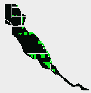
The image above shows all residential areas that fall within the flood zone in green.
Discussion:
Difficulties:
This is a fairly straight-forward exercise. The only difficulty I encountered was due to the fact that I just upgraded to ArcGIS 10.2, and my Spatial Analyst extension was not enabled by default. This is a simple fix that is available through the customize file menu.
Evaluation:
To quickly ensure that my results make sense I used the swipe tool to ensure that all areas deemed to be residential and in the flood zone (the green pixels in the image above) were in fact residential in the original land use raster (yellow pixels in the original).
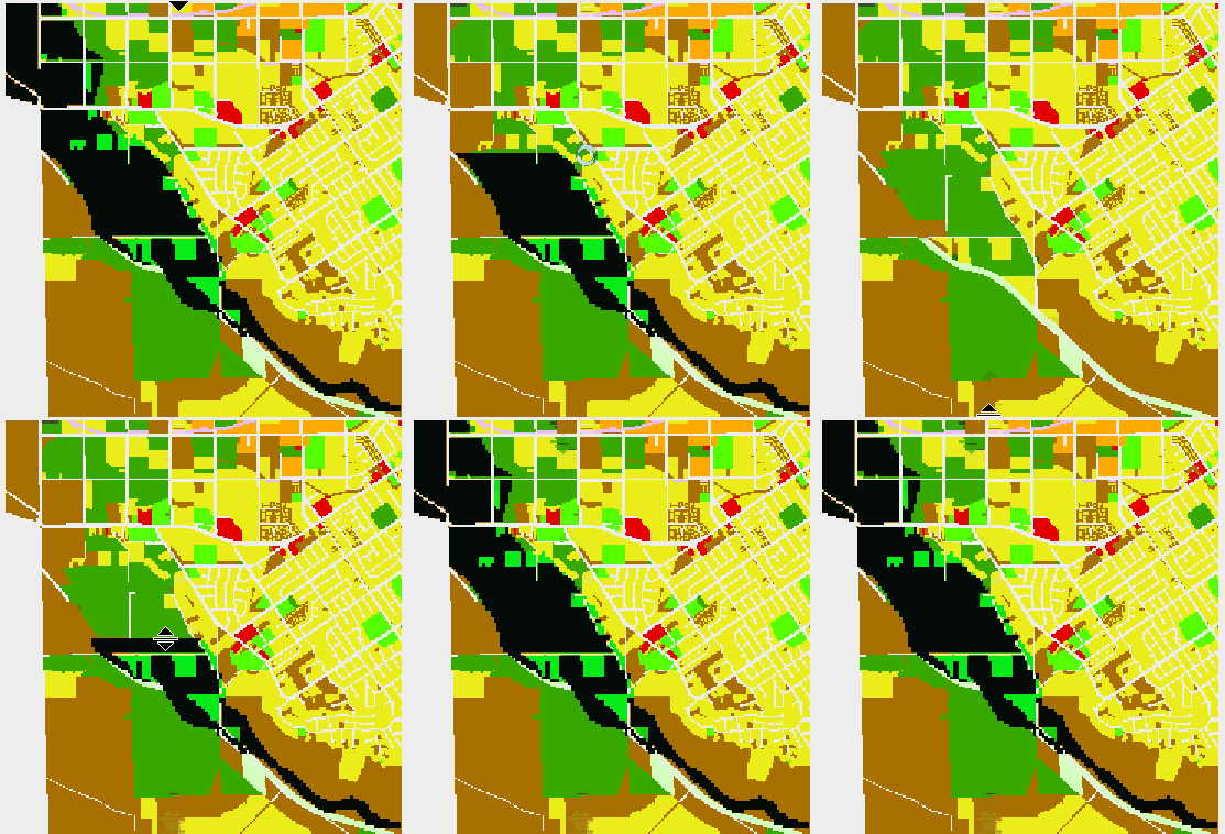
The image above compares my final result with the original land use raster to ensure that all areas in my result were originally of the residential category.
Application & Reflection:
This simple raster analysis is a common technique in the world of natural resource management. As an example, if I were interested in finding a rare species I might make a similar model using habitat characteristics including distance to water, distance to roads, soil characteristics, etc.
This use-case wouldn’t be as cut-and-dry as whether a house falls within a flood zone or not as species can survive in sub-optimal habitat. A particular pixel should not be discarded just because it doesn’t meet every single habitat requirement. It this case we might use a habitat quality scale where we aggregate the different layer scores into a raster representing habitat quality. We could then further classify those scores into groups such as Optimal, Marginal, and Poor. With this knowledge we could prioritize surveys for the rare species in the optimal habitat.
Module II: Cartography, Map Production, and Geovisualization
Problem:
How can we visualize a dataset at different scales using GIS? Why would the scale dictate how, or which layer is drawn on a map?
Analysis Procedures:
Strategies:
Using a GIS to visualize spatial datasets gives us the ability to explore our data at varying spatial scales. The importance of layers and their detail depends directly on the scale of the map. We can use ArcGIS to simplify features so the detail is coarse for small-scale maps. As we zoom in on a feature we might want all the detail afforded to us by our original dataset. This is usually the case for large-scale maps.
Methods:
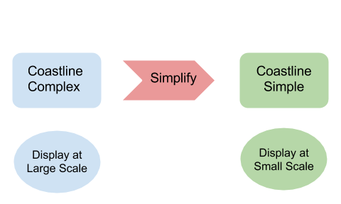
ArcGIS provides a cartographic tool for simplifying lines and polygons. For this exercise I will reduce the amount of detail in the original Coastline feature by creating a simplified version. To complete this technique I would display only the simplified features at 1:200,000 and above. When I zoom to larger scale the simplified coastline will turn off, and the more complex coastline will be turned on.
Discussion:
Difficulties:
I didn’t experience any difficulties with the simplify geoprocessing tool. The only difficulty one might encounter is making sure to turning the correct layer on and off depending on the map’s scale.
Evaluation:
This technique successfully displayed the amount of complexity required to display a coastline at varying scales. The example below keeps both layers on at large-scales to juxtapose the complexity of the two layers. In a production map it would be appropriate to display only one of the two layers at a time.
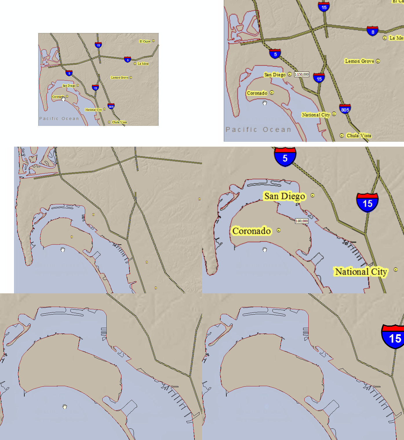
In the image above contrasts the two coastline shapefiles showing two levels of detail. You’ll also notice that the city points and their labels disappear when you get to a very large scale.
Application & Reflection:
My job as a Regional GIS professional requires that I work at varying spatial scales. My agency has over a dozen field stations in the Southeast that collect and work with data at much larger scales on a daily basis. When aggregating or comparing datasets region-wide it is important to keep scale in mind. I often use the simplify tool in my cartographic products to account for different scales.
Module III: Query and Measurement
Problem:
Use measurement and queries in a raster analysis to find suitable areas for a new vineyard.
Analysis Procedures:
Strategies:
In order to locate a new vineyard I need to specify the environmental factors that facilitate good grape growing. A combination of elevation, temperature, and aspect contribute to a successful vineyard. The ability of a vineyard to attract patrons to their location also increases sales so proximity to freeways can increase visitorship.
Methods:
Once again I’ll use the raster calculator tool in ArcGIS to query desirable environmental factors to locate my new vineyard. In each case I’ll reclassify the continuous value of a given raster layer to either one, which represents a hospitable grape growing environment, or zero, which are areas that I will exclude from consideration.
Once I have my environmental factors I’ll consider the accessibility of my location to my customers. In this case my input layer is a vector dataset of freeways. I need to convert the vector dataset to a raster so I can compare apples-to-apples using only rasters in my final analysis. The euclidean distance tool will do this for me; I receive an output raster representing each cell as a distance from a freeway. Again I’ll enforce a limit on the total distance that I can locate from a freeway to ensure high visitorship.
Finally I combine all of these rasters to find only those cells with a value of one for each of the different raster layers.
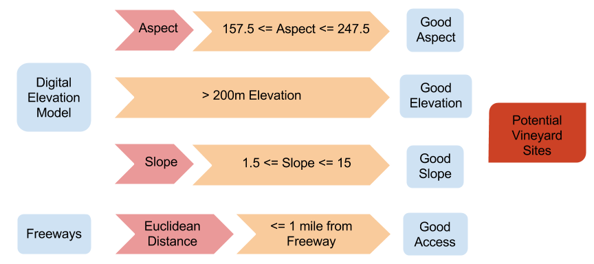
The diagram above shows the analysis steps used to isolate potential vineyard sites. Geographic features are in blue, geoprocessing tasks are in light red, queries and measurements are in orange, and the final output is in dark red. The intermediate rasters (Good [variable]) have a value of 1 if they meet the query criteria and a value of 0 if they do not. To get the final output these intermediate rasters are multiplied together; any cell that has a value of 0 for will be excluded from the final output.
Discussion:
Difficulties:
I made a mistake in defining the criteria for the elevation raster calculation. When I tried to re-run the tool with the correct value of 200 I was unable to overwrite the original raster. It would be helpful if ESRI provided an option for overwriting an output when you run a geoprocessing tool rather than forcing you to change environment variables, or manually deleting a dataset.
Evaluation:
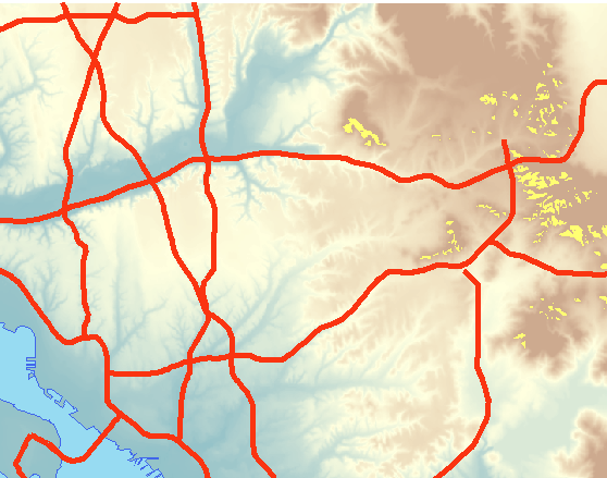
In the photo above the areas in bright yellow represent land suitable for a new vineyard. These areas fulfill all of our requirements including aspect, slope, elevation, and proximity to a freeway.
Most of the factors in this raster analysis were fairly well distributed across the entire area of interest. The limiting factor (the least common factor to meet our criteria) was elevation greater than 200. Based on a visual analysis of the individual input layers and the final output I am confident in my results.
Application & Reflection:
This exercise is similar to the flood zone exercise from module one. The difference here is that we’re considering a larger number of layers, and we’re combining both raster and vector input layers. The directions for this exercise suggest testing that each individual layer is equal to a value of 1. We could just as easily multiply the separate rasters together. Any layer with a value of zero (unsuitable for growing grapes) would remove that cell from consideration in our final raster, because any number multiplied by zero equals zero.
Module IV: Transformations and Descriptive Summaries
Transformation and descriptive summaries each provide something new. Until now we’ve simply been asking our data questions. To generate new information we can use tools in GIS and Statistics.
Problem:
How can we use spatial interpolation to create a surface that infers elevation between a series of sample points?
Analysis Procedures:
Strategies:
Creating an interpolated surface of any variable can be useful in describing a spatial phenomenon in a cost effective way. Rather than surveying every inch of a given area of interest we can survey a representative sample of the whole area and infer values that fall in between our sample sites. This strategy is useful with continuous variables like mercury concentration in soil as opposed to discrete variables like land cover types. In this exercise I’ll take an input of sample elevation points and interpolate a surface using ArcGIS’s Spatial Analyst toolkit.
Methods:
In the interpolation exercise from this module we were given a feature class of sample locations describing elevation. We used these elevation points as the input for two different interpolation methods: Kriging and Inverse Distance Weighting (IDW). Each method produces a continuous elevation surface by filling in the gaps between sampling points. We then created a hillshade for each surface to as a cartographic technique to exemplify the differences between the two methods. We repeated the process above with the same sample dataset once more for each interpolation method after reducing the number of sample points by 5% then compared the results.
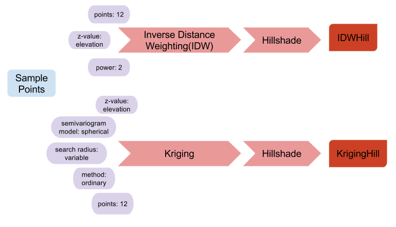
The diagram above shows the first iteration of this exercise. The blue element is our input sample points. The red arrows represent geoprocessing tasks with the purple elements representing the tool inputs. Finally the dark red elements are the final outputs from the exercise.
Discussion:
Difficulties:
I didn’t experience any difficulties completing this exercise, but there are difficulties associated with collecting the data that you would like to interpolate. Choosing sample locations can have a huge impact on the results you get from an interpolation analysis. Whenever possible you should employ a random sampling regime in order to get representative results. Many times sampling is opportunistic focusing on areas that are easy to get to near roads or waterways, which might not be representative of the entire area of interest.
It can be difficult to get a representative sample of a given area. Private landowners may not grant you access to sample their land. You may be sampling an area with extremely dense vegetation, which could make it difficult to sample throughout the entire area.
Evaluation:
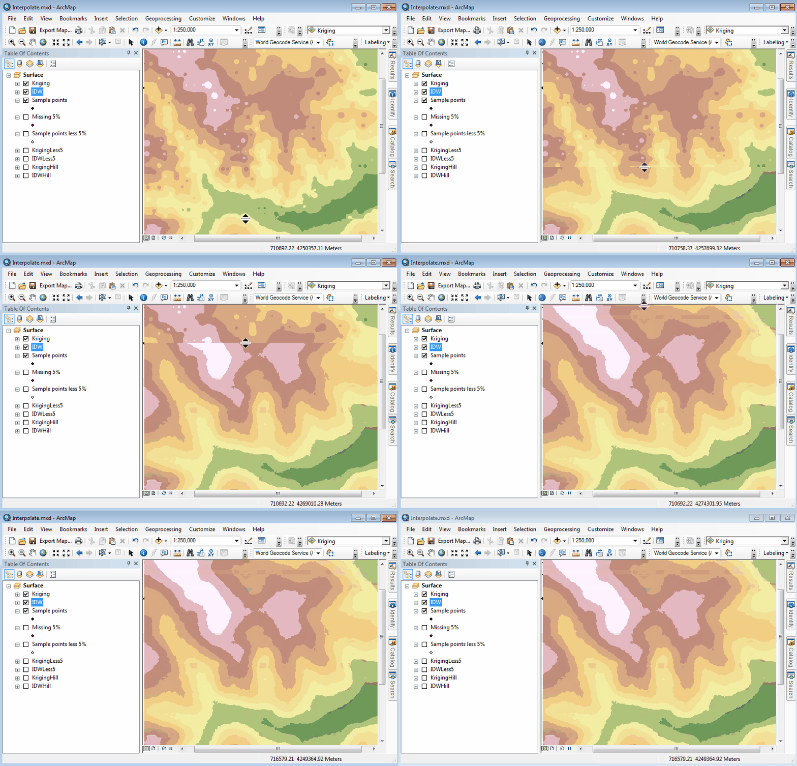
The image above shows two different interpolation techniques, IDW vs. Kriging, on the same input dataset. This is also an example of geovisualization using ESRI’s built in “swipe” tool.
The results of both interpolation methods appear to be accurate. The two different techniques employ different methodologies, which explains why the two surfaces had different outputs. The sample points we were given were fairly well distributed. If, instead, there was lots of clustering I would trust the results of Kriging over IDW because Kriging takes clustering into account.
Application & Reflection:
Interpolation techniques are common in natural resource management agencies. This is a great technique for surveying the presence of submerged aquatic vegetation (SAV) in the Chesapeake Bay. Without interpolation SAV surveys would be very difficult and costly and might require divers to visually inspect large swaths of the bay’s floor. Instead we can drag an SAV rake from a boat at random sample locations to collect species and density information. Given these points we can use interpolation techniques to create a surface that shows the distribution and density of different SAV species. SAV is an important indicator of ecosystem health so the interpolated surfaces could be used to target restoration work.
Module V: Optimization and Hypothesis Testing
The term optimization is very general and can refer to a number of different analysis techniques. The common denominator is that we’re either trying to minimize costs or maximize benefits using a series of spatial datasets.
Problem:
Determine the most cost effective path for the construction of a new power line.
Analysis Procedures:
Strategies:
We will be using a series of raster datasets to find the least-cost path for the new power line using ArcMap’s Spatial Analyst extension. We will assign values to specific attributes that contribute to the overall cost of a construction project. We will then use ArcMap to determine the exact path that minimizes the total cost of construction for the new power line.
Methods:
We will be categorizing the cost of construction based on slope, cost-weighted distance analysis, and land-use through using raster math. Higher grades of slope require additional engineering, which in turn raises costs. As the total distance of the power line increases so does cost. Finally, certain land-cover types are associated with increased costs as well. For example it is much more cost effective to traverse abandoned or vacant land than commercial or residential areas.
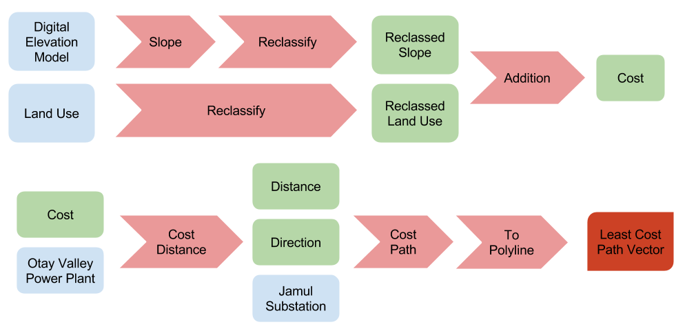
The diagram above shows the analysis steps required to find the least cost path for the new power line connecting the power plant with the Jamula substation. Inputs are in blue, intermediate files are in green, geoprocessing tasks are in light red, and the final output is in dark red. In some cases where back-to-back geoprocessing tasks were required the intermediate file was left out of the diagram for succinctness.
The diagram above shows
Discussion:
Difficulties:
Initially when I completed this exercise the default color of the line created as an output of the geoprocessing tool blended in with my background image. I was very confused as to why the tool didn’t generate a least-cost path, but eventually I realized resolving the issue was simple a matter of changing the layer’s symbology.
Evaluation:
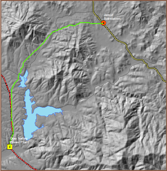
The dashed green line in the image above shows the least-cost path for construction of a new power line connecting a power plant with a substation.
Application & Reflection:
With the explosion of natural gas development in the United States development of energy infrastructure is growing rapidly. As a natural resource management agency we are charged with maintaining biodiversity even with increased pressure from development. Pipeline projects that connect natural gas pads with refineries must comply with State and Federal law. Both developers and biologists must consider the same regulations and geographic data when proposing and approving development projects. Pipeline projects would use very similar methods as those completed in this exercise in order to minimize costs not only of construction, but also degradation of wildlife habitat. Often times these types of projects cannot completely avoid wildlife and their habitat, and are thus required to mitigate any damage by restoring other habitat for the benefit of wildlife.